

A kitchen looks expensive when its colors feel intentional, layered, and tied to quality materials. Soft whites, warm off-whites, deep greens, navy blues, charcoal grays, and muted earth tones consistently read as high-end. The right palette adds depth, calms visual noise, and lets cabinetry, counters, and lighting do their job. Color choice alone can shift a kitchen from builder-grade to custom without a full renovation, which is why homeowners and property managers prioritize it first.
The Colors That Instantly Make a Kitchen Look Expensive
The colors that make a kitchen look expensive are soft whites, warm off-whites, deep greens, navy blue, charcoal gray, and muted earth tones like clay, mushroom, and taupe. These shades feel grounded, pair well with natural materials, and create the layered, tailored look found in custom-designed kitchens.
These tones work because they reflect light gracefully, hide wear, and complement quartz, marble, brass, and wood. They also avoid the flat, overly bright finishes common in low-cost builds.
Soft Whites and Warm Off-Whites
Soft whites such as alabaster, bone, and warm ivory create a clean, gallery-like backdrop without feeling sterile. Unlike pure white, they carry subtle yellow or gray undertones that soften under both natural and warm artificial light. These shades pair beautifully with brushed brass hardware, light oak floors, and veined quartz counters. For rental properties and resale-focused homes, warm whites also photograph well and appeal broadly. They make small kitchens feel larger and large kitchens feel curated, which is why designers default to them in luxury builds.
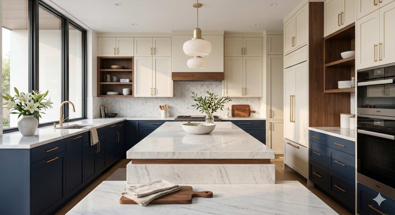
Deep Greens, Navy, and Charcoal
Deep tones add weight and richness that signal craftsmanship. Forest green, sage, navy blue, and charcoal gray work especially well on lower cabinets, islands, or a single accent wall. Paired with white uppers, brass pulls, and stone counters, these colors create the two-tone effect popular in upscale kitchens. They hide fingerprints, scuffs, and daily use better than light shades, making them practical for busy households. Matte and satin finishes deepen the color further, giving cabinetry a furniture-grade appearance instead of a sprayed factory look.
A polished color scheme only works when the application matches the vision. That is where professional kitchen cabinet painting shapes the final result, since prep, primer, and finish quality determine whether the color reads as custom or cheap.
How to Apply These Colors for a High-End Look
Color choice is only half the equation. Placement, finish, and pairing decide whether the kitchen looks luxurious or busy. The most expensive-looking kitchens follow a simple rule: one dominant tone, one supporting tone, and one metallic or natural accent. This balance prevents the space from feeling decorated and lets materials speak.
Pairing Cabinets, Walls, and Accents
Use deeper colors on lower cabinets and islands to ground the room, then keep upper cabinets and walls in soft whites or warm neutrals to lift the eye. Match grout to tile, choose hardware in unlacquered brass or matte black, and keep counters in honed stone or quartz with subtle veining. Avoid more than three core colors. If repainting alone will not deliver the look, a full kitchen remodel addresses cabinetry, lighting, and finishes together for a cohesive upgrade.
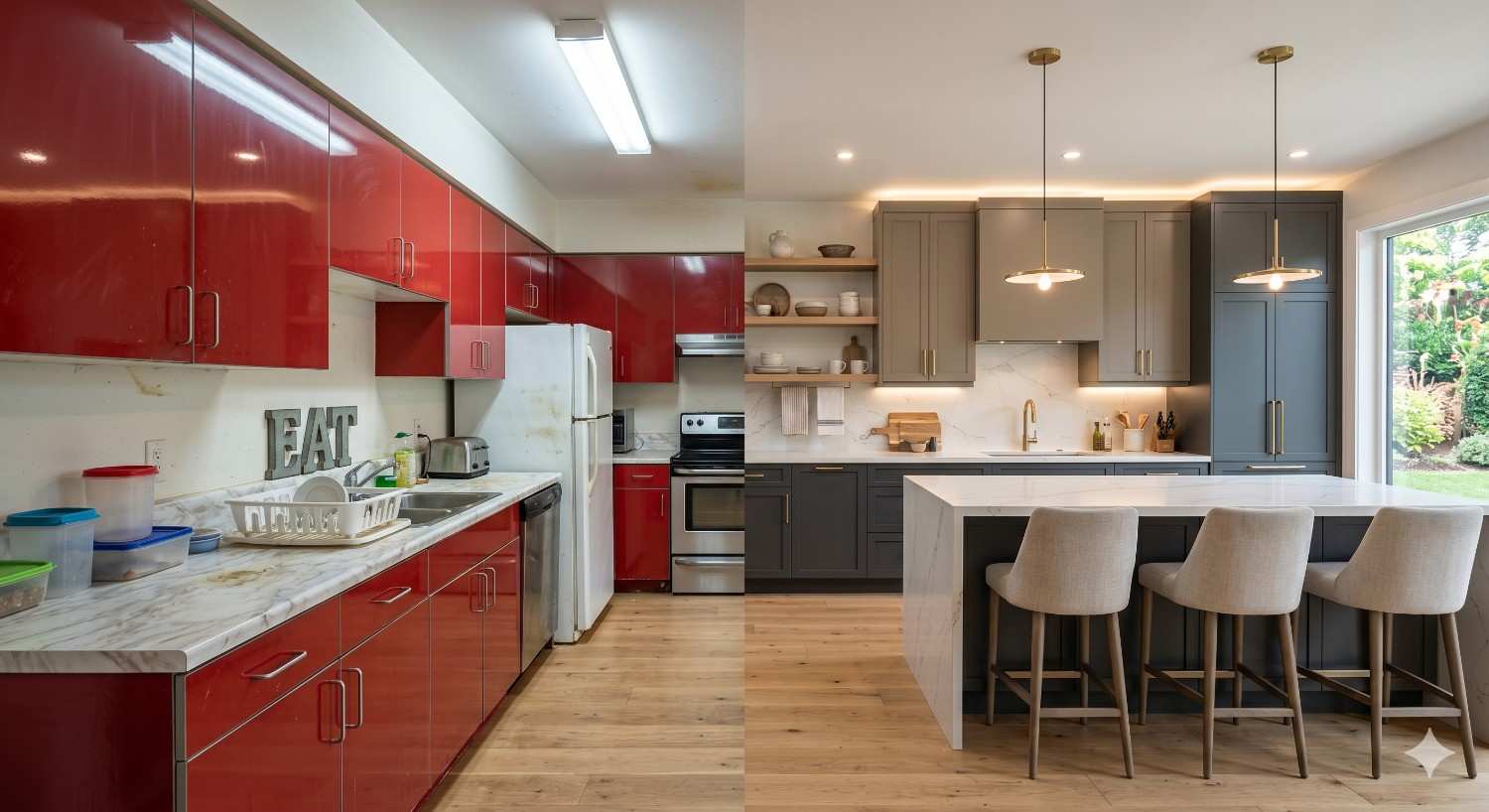
Colors and Finishes That Cheapen a Kitchen
Some color choices undercut even high-quality cabinets. Bright primary reds, glossy yellows, cool stark whites, and orange-toned wood stains often read as dated or builder-grade. High-gloss finishes show every flaw, while mismatched undertones, like cool gray cabinets with warm beige floors, create visual tension. Skip novelty accent walls, multicolor backsplashes, and trendy shades with short shelf lives. Stick with timeless tones in matte or satin sheens for a kitchen that holds its value.
Conclusion
Soft whites, deep greens, navy, charcoal, and muted earth tones consistently make kitchens look expensive when paired with quality finishes and disciplined color placement.
For homeowners, landlords, and property managers, the right palette protects long-term value and supports stronger resale, rental appeal, and daily livability across every property type.
We help you choose, apply, and finish the perfect kitchen color scheme. Contact Mr. Local Services today to connect with trusted painting and remodeling professionals near you.
Frequently Asked Questions
What is the most expensive-looking color for kitchen cabinets?
Deep forest green, navy blue, and warm off-white consistently look the most expensive, especially in matte or satin finishes paired with brass or matte black hardware.
Do dark or light kitchens look more luxurious?
Both can look luxurious. Two-tone kitchens with dark lowers and light uppers often feel the most high-end because they add depth without overwhelming the space.
What color kitchen sells a house fastest?
Warm white, soft greige, and light sage kitchens sell fastest. They appeal to broad buyer tastes and photograph well in real estate listings.
Should kitchen walls be lighter or darker than cabinets?
Walls usually look best slightly lighter than cabinets. This keeps the cabinetry as the focal point and prevents the room from feeling closed in.
What kitchen colors are timeless?
Soft white, warm beige, charcoal gray, navy, and sage green are timeless. They outlast trends and adapt easily to new hardware, counters, or backsplash updates.


